The Ask
Create a logo for Verizon's new employee group, Verizon Hiking Club.
Overview and Target Audience
The Verizon Hiking Club is a new internal initiative aimed at promoting outdoor activity, wellness, and team building among Verizon employees.
We want to create a logo that reflects the spirit of adventure, community, and nature, while still aligning with Verizon’s established brand identity.
We want to create a logo that reflects the spirit of adventure, community, and nature, while still aligning with Verizon’s established brand identity.
This logo will be used on various platforms, including email newsletters, intranet pages, event banners, and branded merchandise like t-shirts, hats, and water bottles.
The task is to design a fresh, engaging logo that combines Verizon’s sleek corporate aesthetic with the rugged, natural elements of hiking culture.
The Verizon Hiking Club is for Verizon employees who are outdoor enthusiasts or those looking to get involved in a healthy, active lifestyle. The audience includes a wide range of demographics from different departments, so the design should be welcoming and inclusive.
Key Deliverables
1) A logo that includes text (“Verizon Hiking Club”) and a graphic element.
2) A primary color version (using Verizon’s color palette) and a black-and-white version for more flexible usage.
Design Inspirations
For this project, you’ll want to review Verizon’s existing logos to ensure brand consistency. Look at both corporate and event-specific logos (e.g., Verizon Up, Verizon ERG’s) to understand how the brand’s core identity is adapted for different projects.
In addition, explore hiking club logos or outdoor brands for inspiration. Brands like Patagonia, The North Face, REI, and various national park logos often use elements of nature, adventure, and exploration in their designs. Note how they incorporate earthy colors, geometric shapes, and natural motifs like mountains, trees, or trails.
MOODBOARD
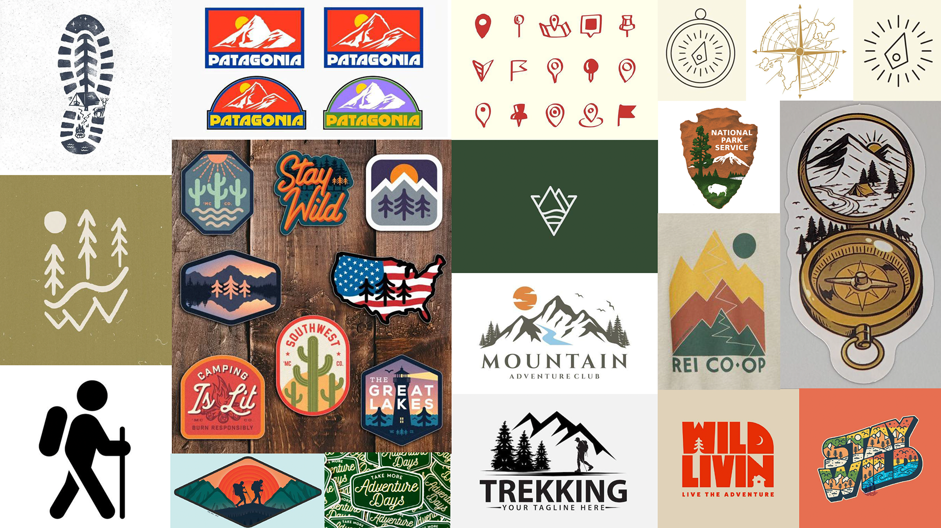
Based on the design inspirations section of the brief above, I created a moodboard on pinterest referencing the brand that were itemized as well as my own thoughts about hiking and how to create a visual identity for a club centered around that activity. I thought of hiking boot tread, stick figures like the signs you see on the road that makes them easy to interpret, compass imagery, different types of pins and markers to signify a destination, as well as blocky text integrated with images as well as small landscapes and scenes that can be perceived as patches and stickers.
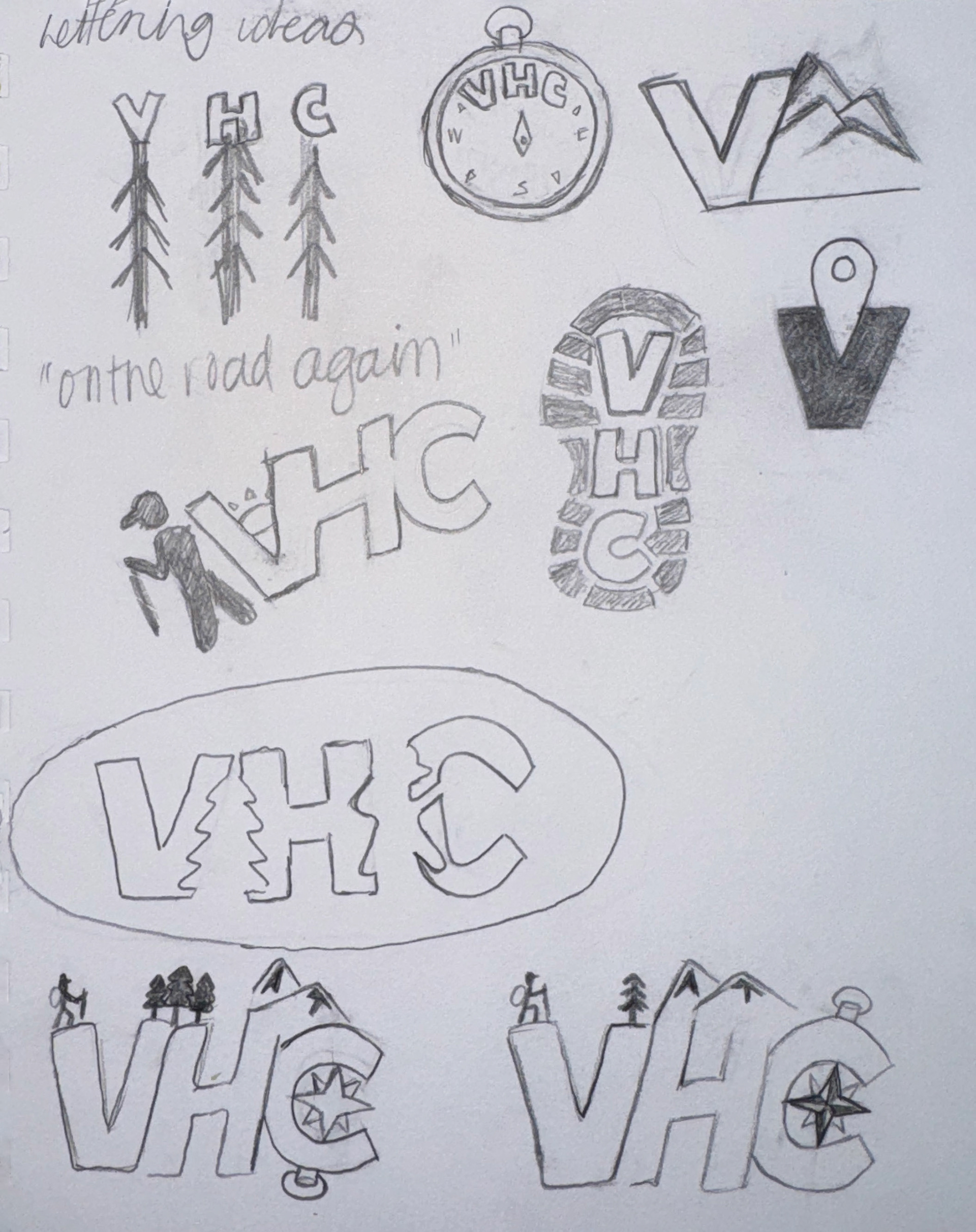
SKETCHES
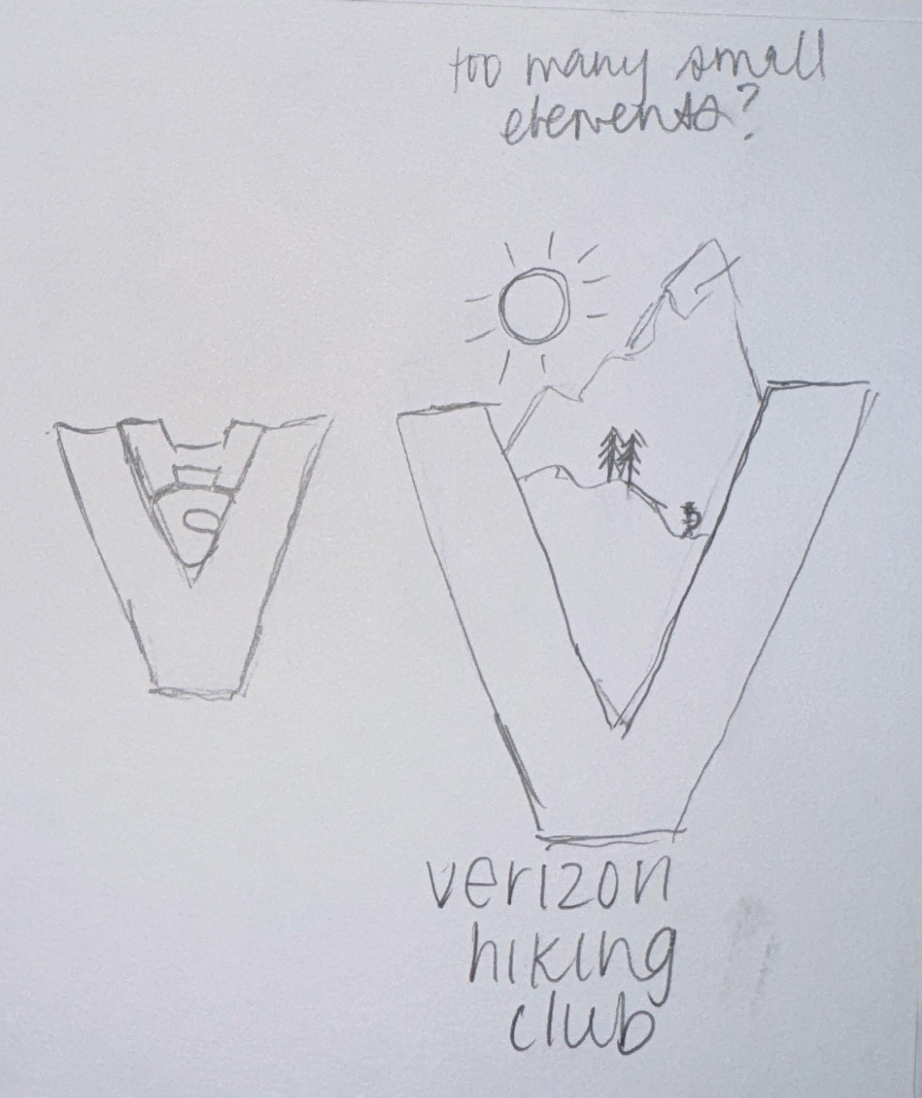
Concurrently, I was creating sketches based on the imagery I was collaging together digitally in the moodboarding step and synthesizing the ideas that came to mind initially when this project was presented to me and came up with text heavy logo sketches, seen below.
DIGITIZING
Next I brought these sketches into Adobe Illustrator and began to apply the Verizon rebrand color palette to my visual ideas. As we can see I came up with at least 10 ideas but whittled it down to 4 for my Round 1 presentation.


The client asked about the community element located inside these lockups and landed on two favorites and after 3 rounds of edits we landed on these final two:
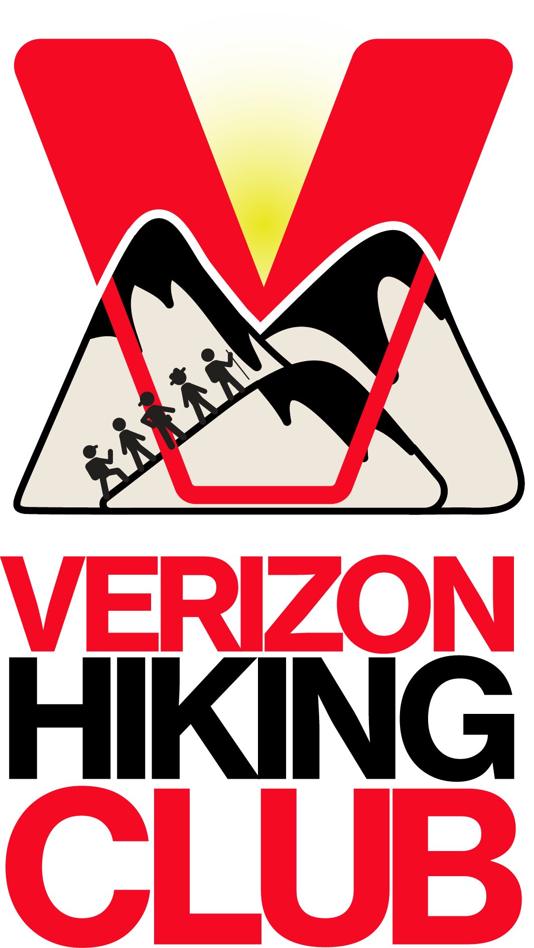
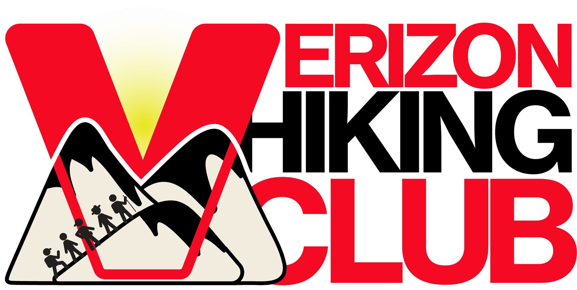
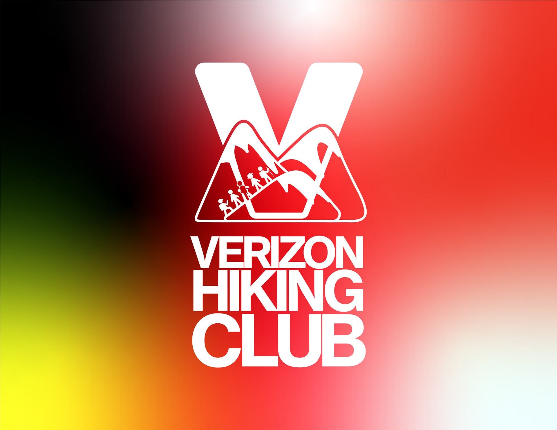
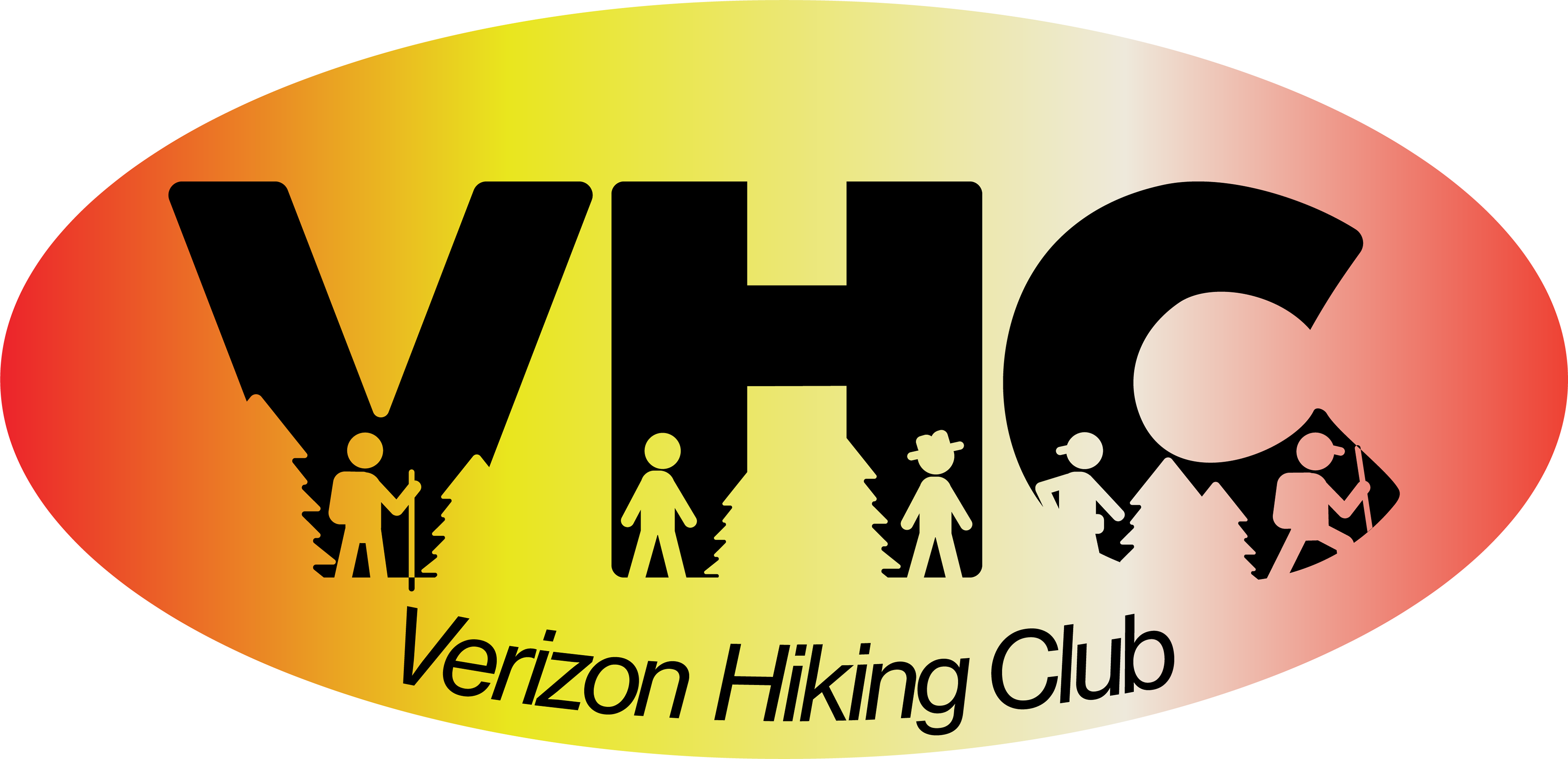
Vertical and Horizontal Color Version of Verizon Valley with a group of hikers ascending the first mountain.
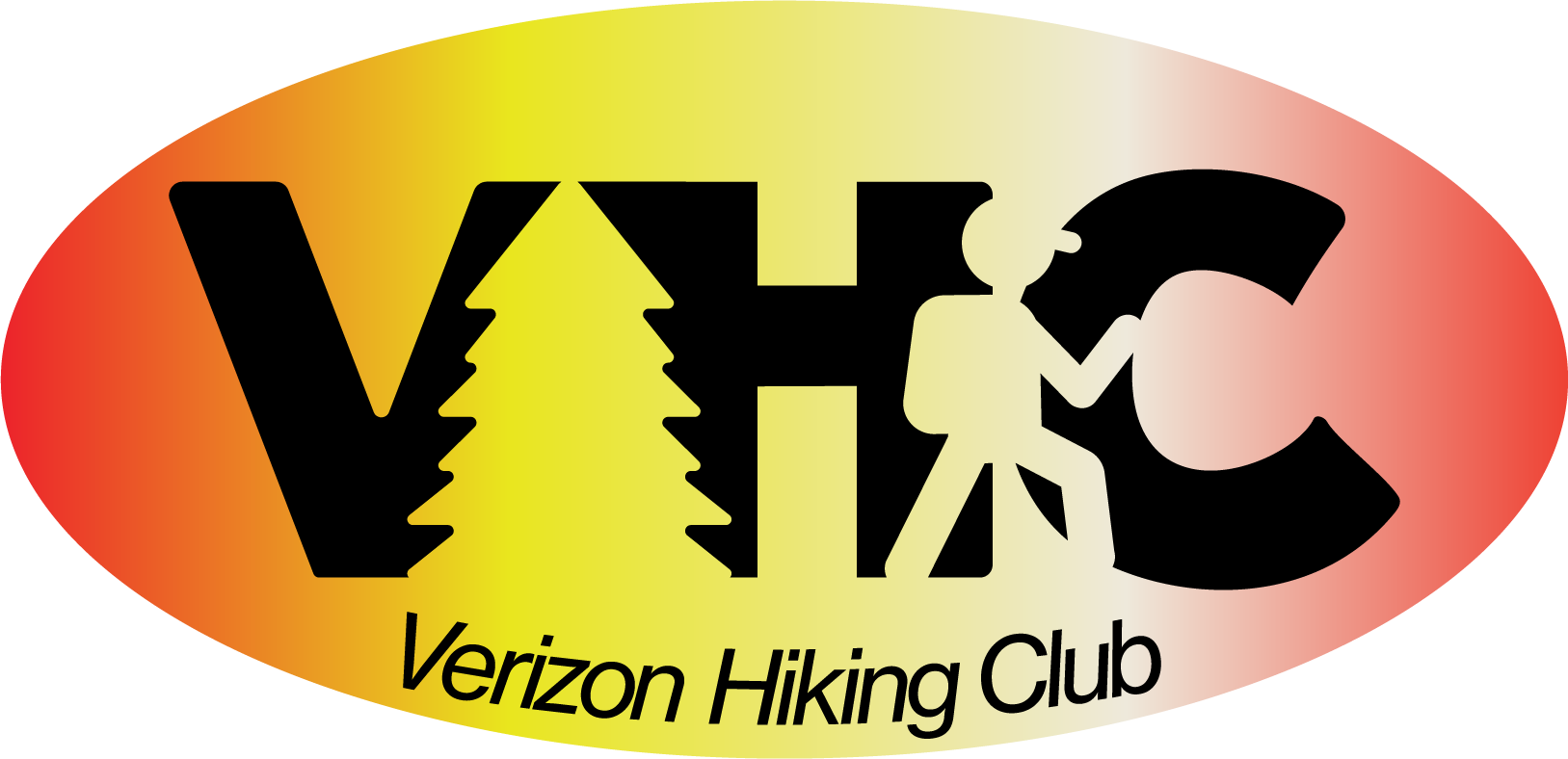
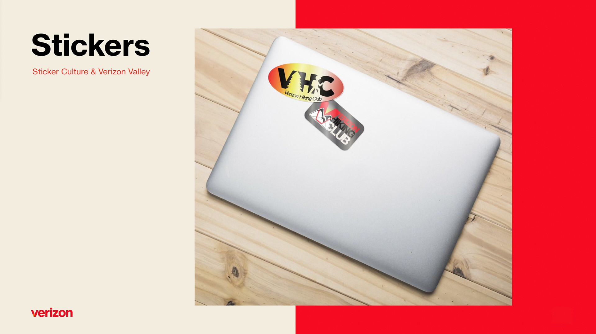
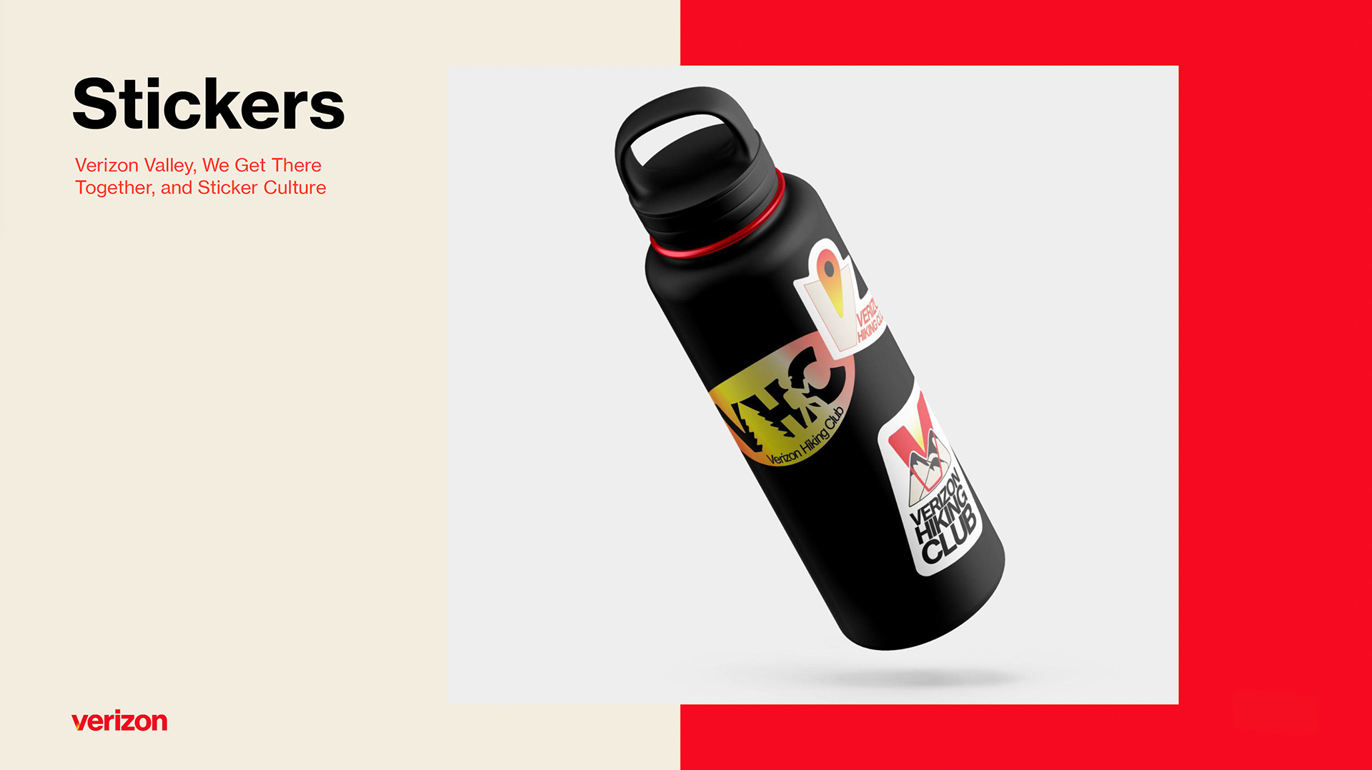
Two versions of Sticker Culture.
If the logo was intended for a space that only allowed it to be smaller than 900px, the left logo would be used so the imagery within the letters would be legible. This logo would. be best suited for a small email banner or intranet icon and possibly a printed internal memo. The right logo is the standard logo for dimensions above 900 px. This standard logo would be suitable for stickers, t-shirt printing, folders, and large printed banners for an event.
If the logo was intended for a space that only allowed it to be smaller than 900px, the left logo would be used so the imagery within the letters would be legible. This logo would. be best suited for a small email banner or intranet icon and possibly a printed internal memo. The right logo is the standard logo for dimensions above 900 px. This standard logo would be suitable for stickers, t-shirt printing, folders, and large printed banners for an event.
MOCKUPS
I created some mockups to really help the clients understand how these logos would live in reality.

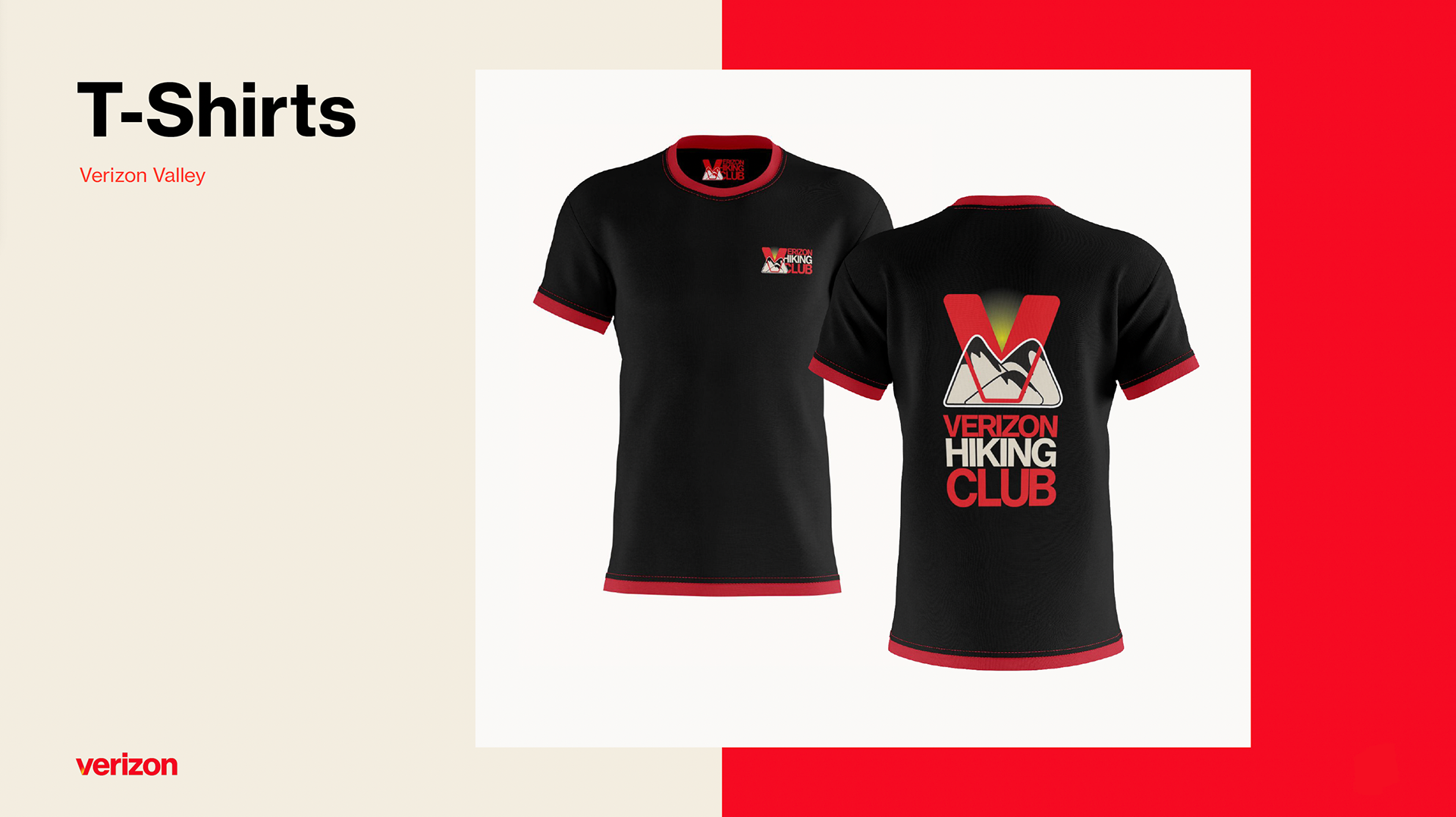
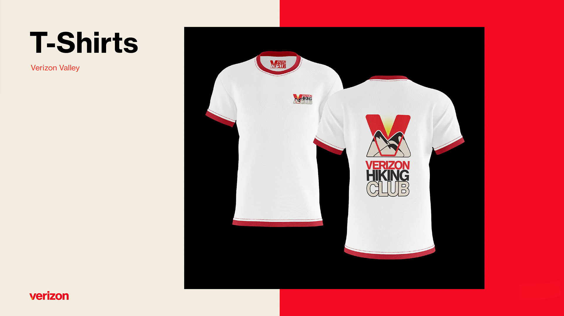
Verizon Valley ended up being the clients' favorite and I was so glad to deliver something great that everyone loved for this new employee initiative.


