The Ask:
redesign an existing brand that you interact with regularly
redesign an existing brand that you interact with regularly
For this redesign, I wanted to see their sturdy mom and pop vegan shop bring on a bit more edge, so I did that with a logo design that came with a few pieces of merchandise and redoing their website design.
Original and Alternative Logo


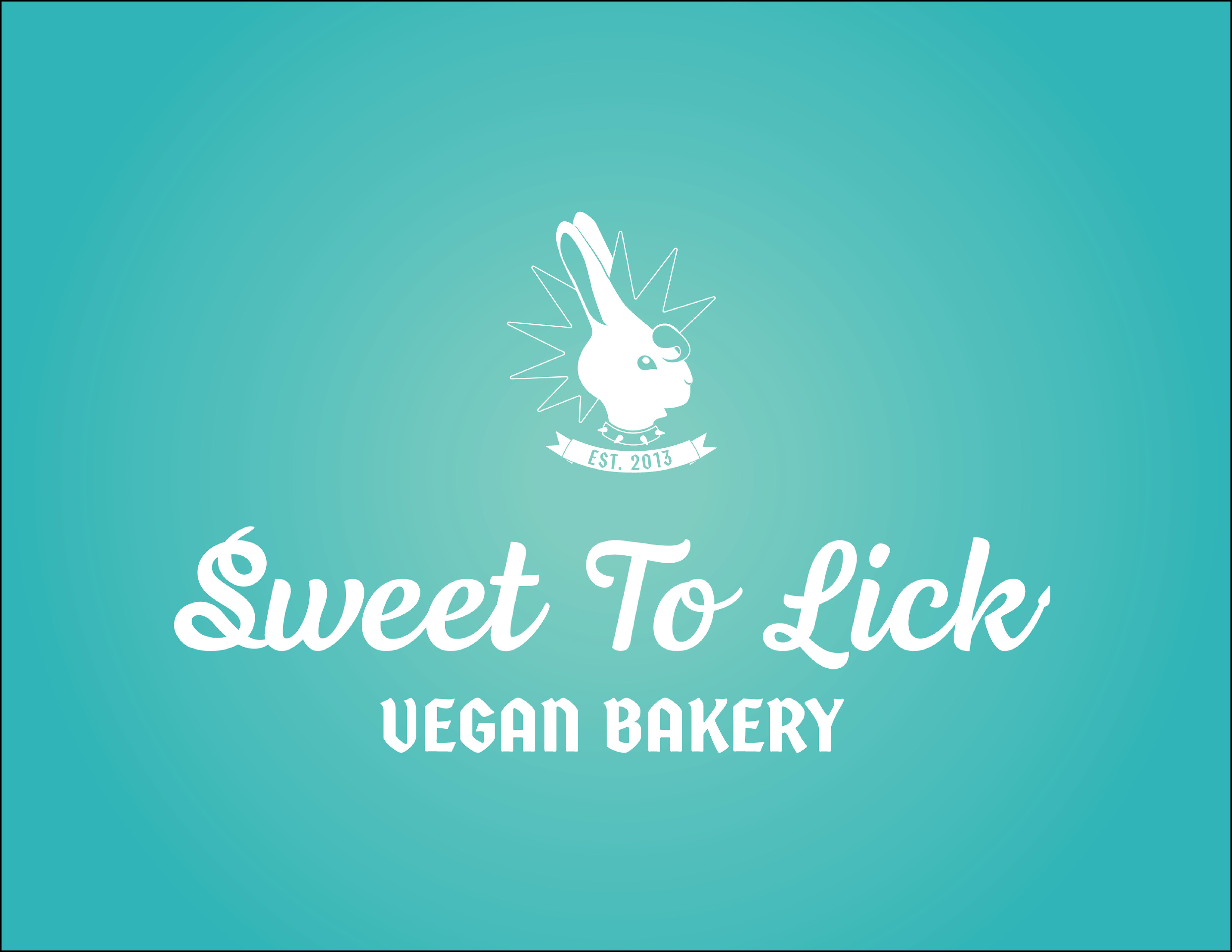
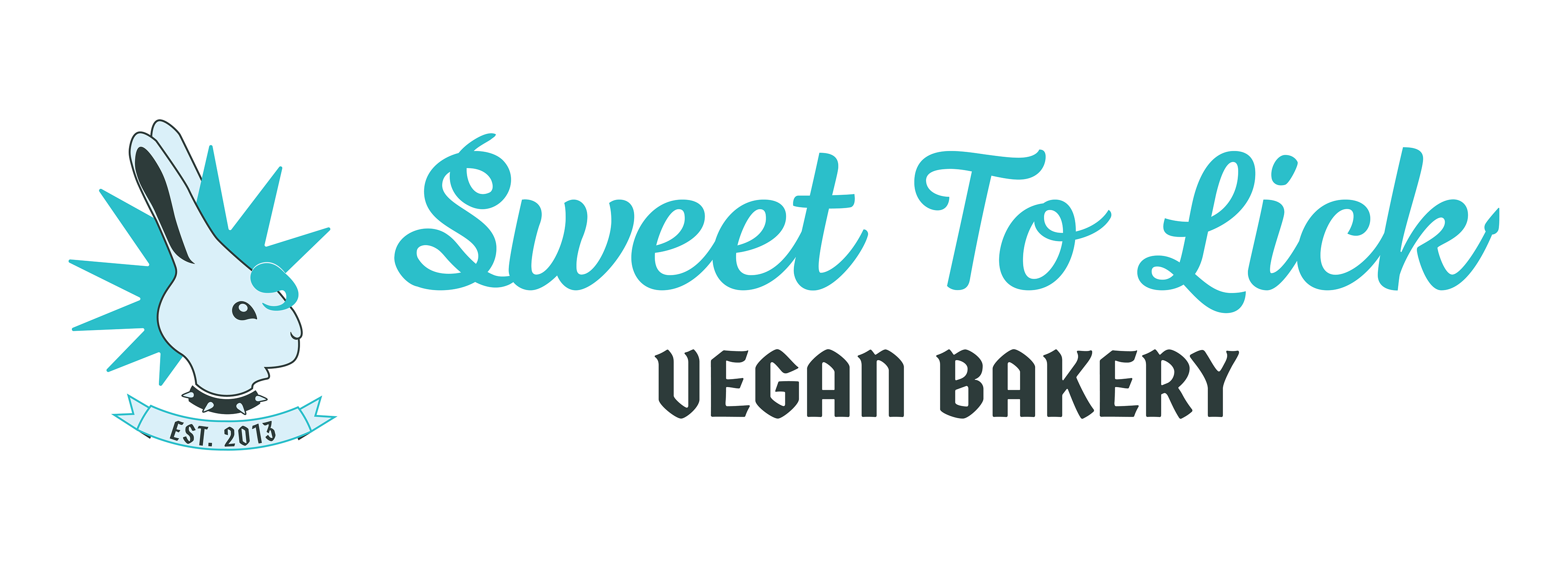
Redesigned Logo
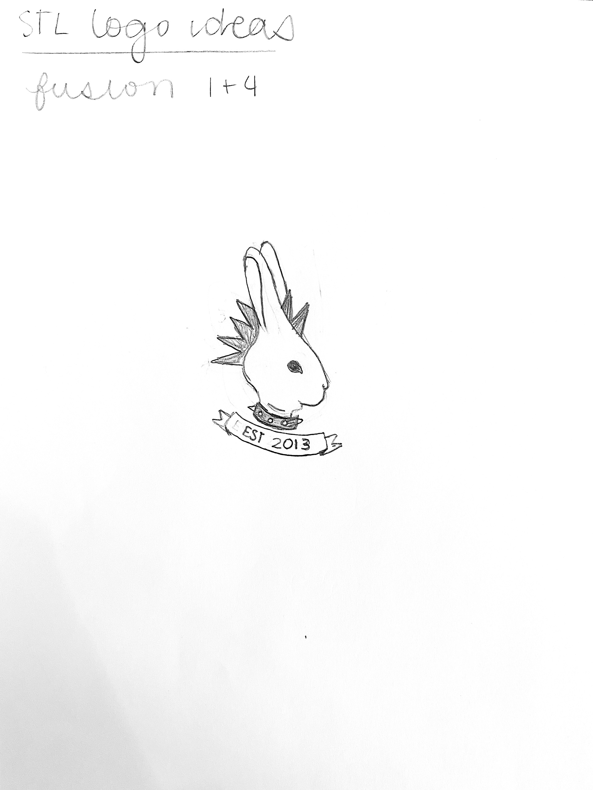
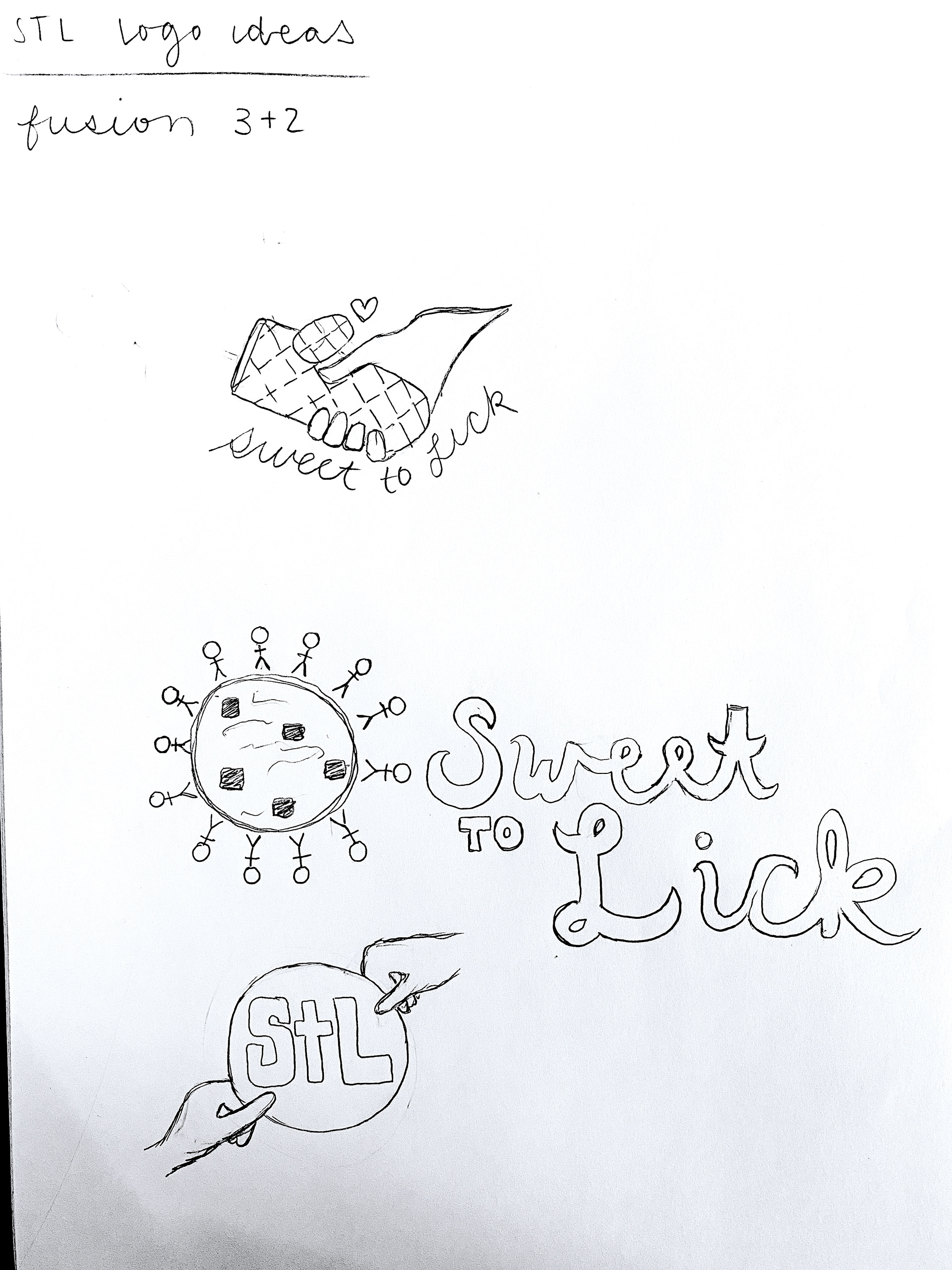
Sketches
Sketches


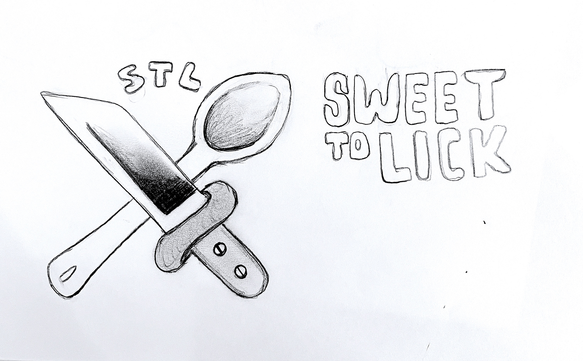
Final
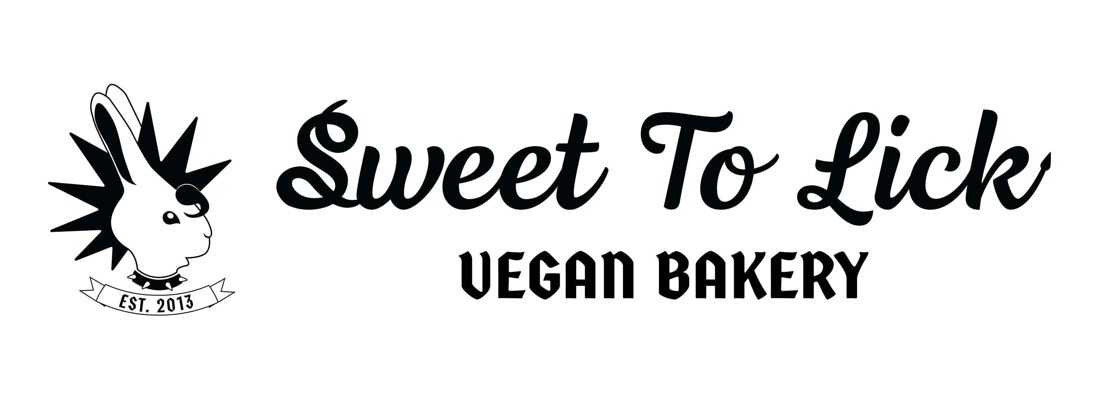
When I interviewed the owner, Michael, he mentioned that Sweet to Lick is about intersectionality. As a kid, Micheal had always felt like "the other," so in his life's work he is often reaching out to those who were othered too; which felt like a punk concept. The mohawk to me always felt like a universal symbol of the punk scene, a subculture started in the 1970s to symbolize the promotion of individual freedom.
I also wanted to provide a juxtaposition of sweet and savory, similar to the offerings available in the bakery– sweet pastries and savory lunch items. The logo type is also another comment on juxtaposition, with the script being the original medallion logo font (LHF Bounce Script) with a few custom added elements. I added a small devil tail at the end of the K and the extra swirls in the S. Those flourishes were a small articulation to the audience that Sweet to Lick is somewhere between the heaven of consuming without hurting animals and the hell that is sugar on your body. Therefore I created this visual identity that advertised how well these opposites attract, how two very different things can be combined and work together. I wanted the logo to advocate for balance, difference, and uniqueness; to promote to the audience that you can come as you are because this bakery and the environment it creates is just as unique.
Original Website Design


The original home page was largely a single scroll page that included photos of the space as well as the owner and copy regarding their journey to opening the storefront. The website also incorporated their instagram feed, providing the weekly content they would share on the platform with another home.
Redesigned Website:
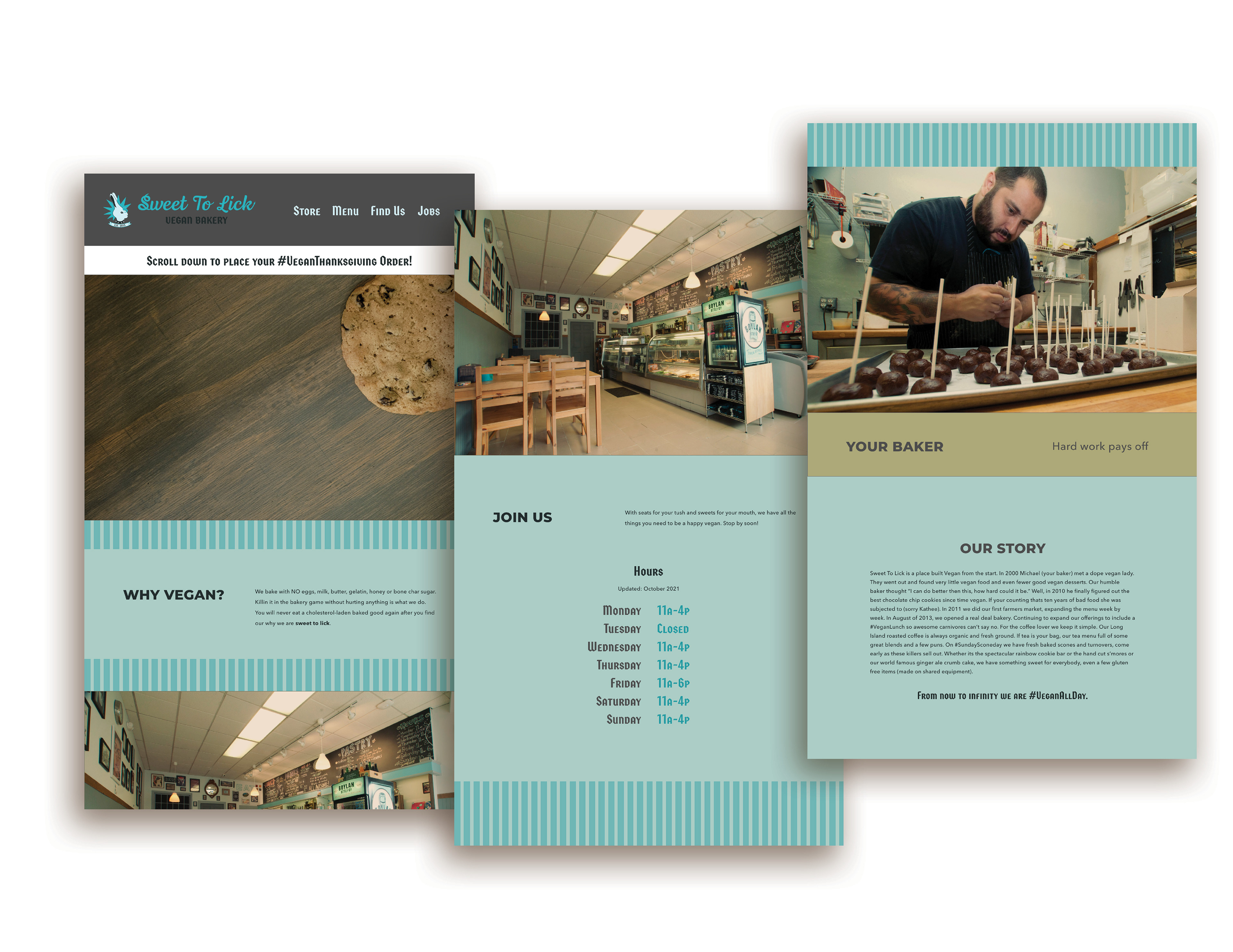
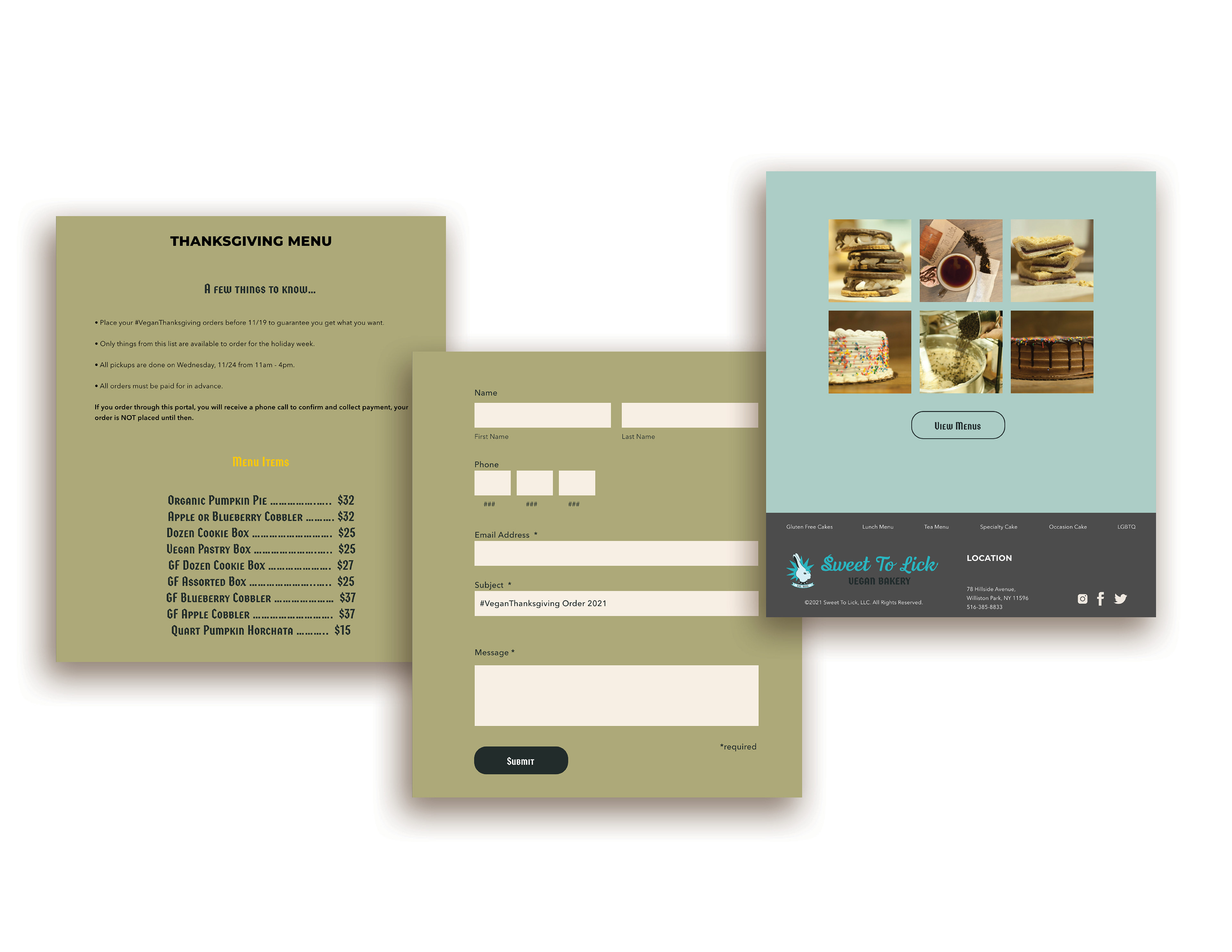
The original brand colors were teal, black and white. In my redesign concept, I incorporated the teal into the website and logo as a predominant focus, but branched out using the cooler browns that can be found around the shop textures as a secondary color as well as a slate grey on top of the black and white for some variance. I added the gothic sans serif font as a detail font throughout the website design to bring forth the cool, edgy energy that the owner brings into the shop. I wanted the redesign to feel like this isn't some grandma's bakery, that it was cool and had edge despite being vegan and predominantly dessert centered.
Original Merchandise and Packaging:


Merchandise and packaging redesign:
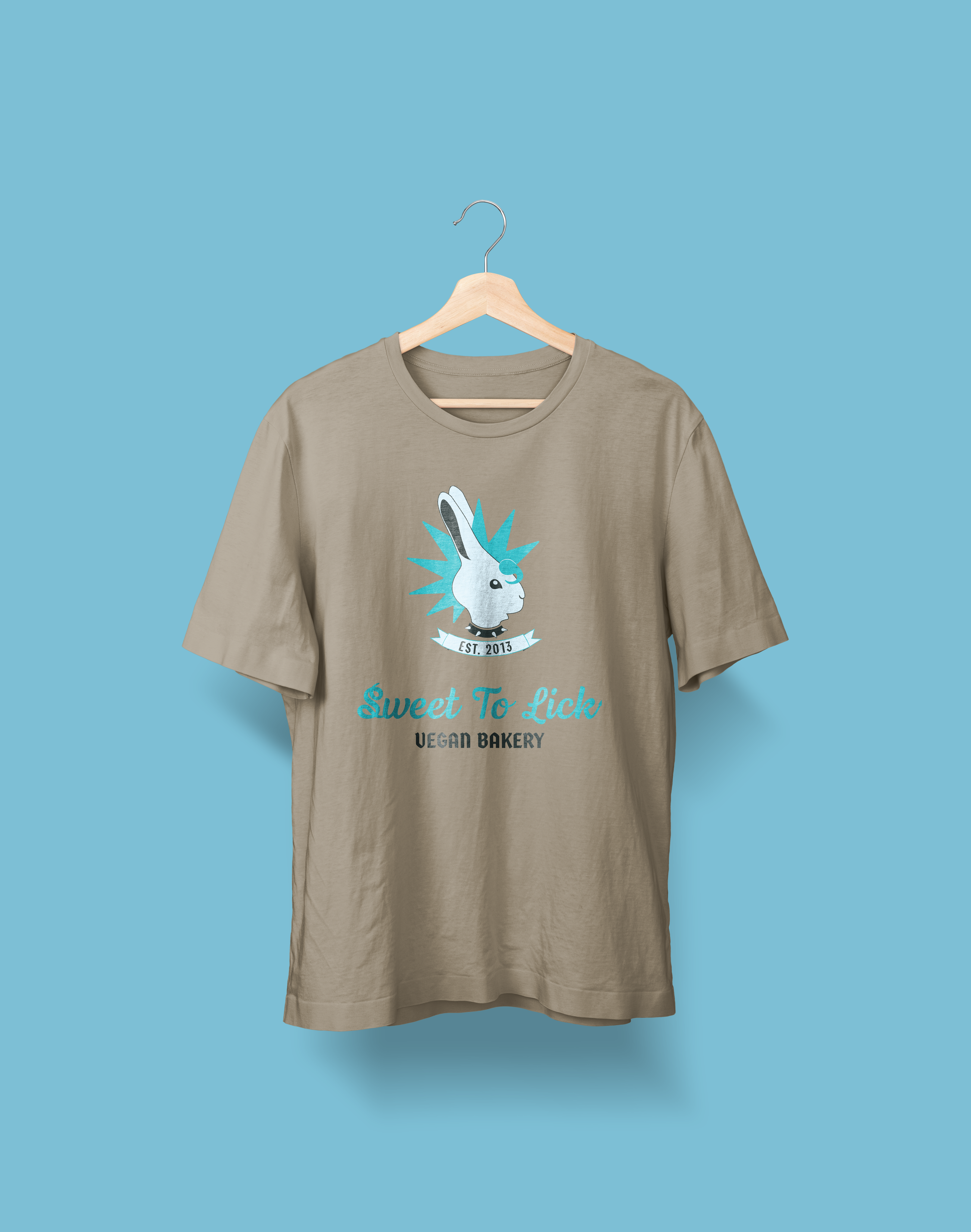
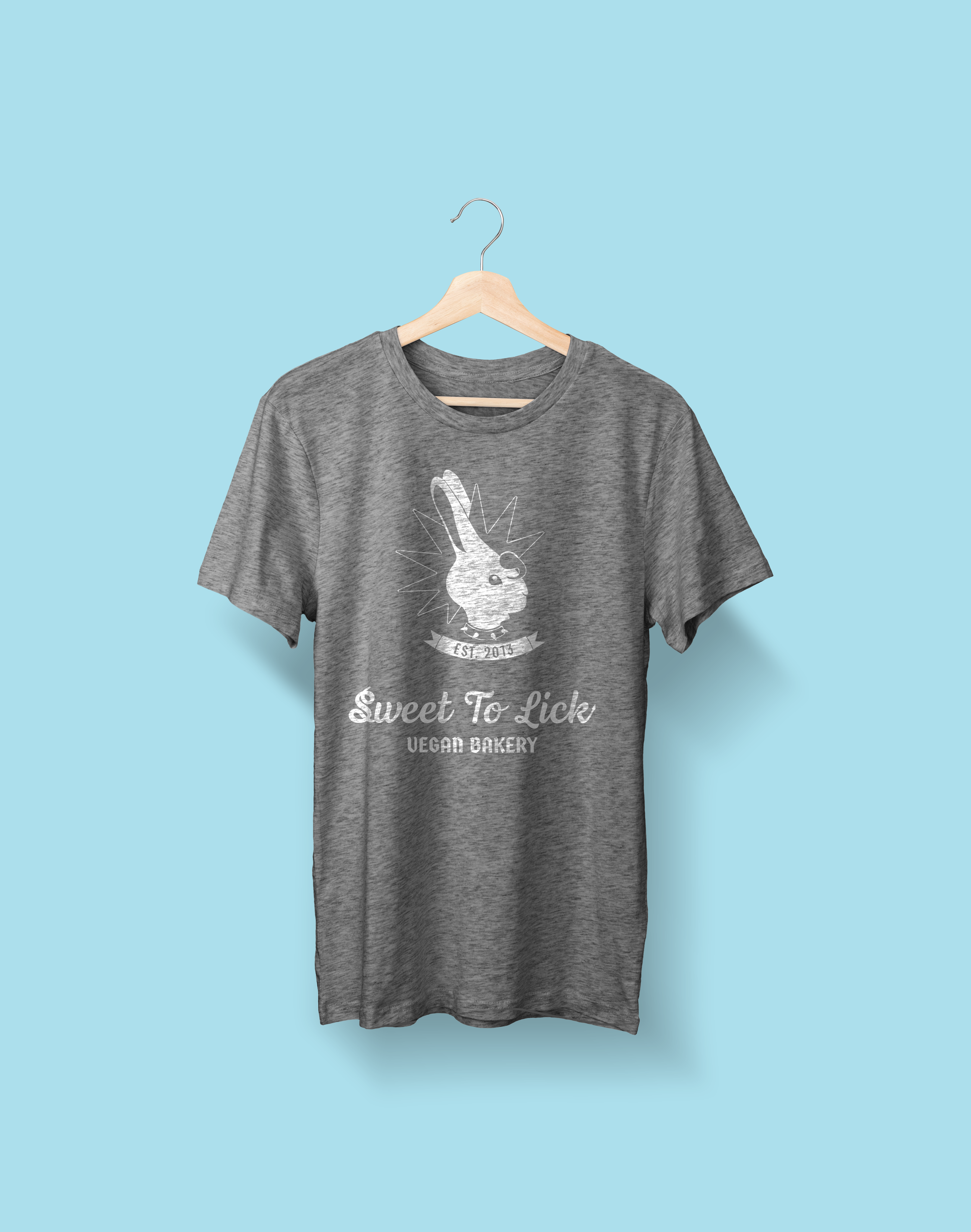
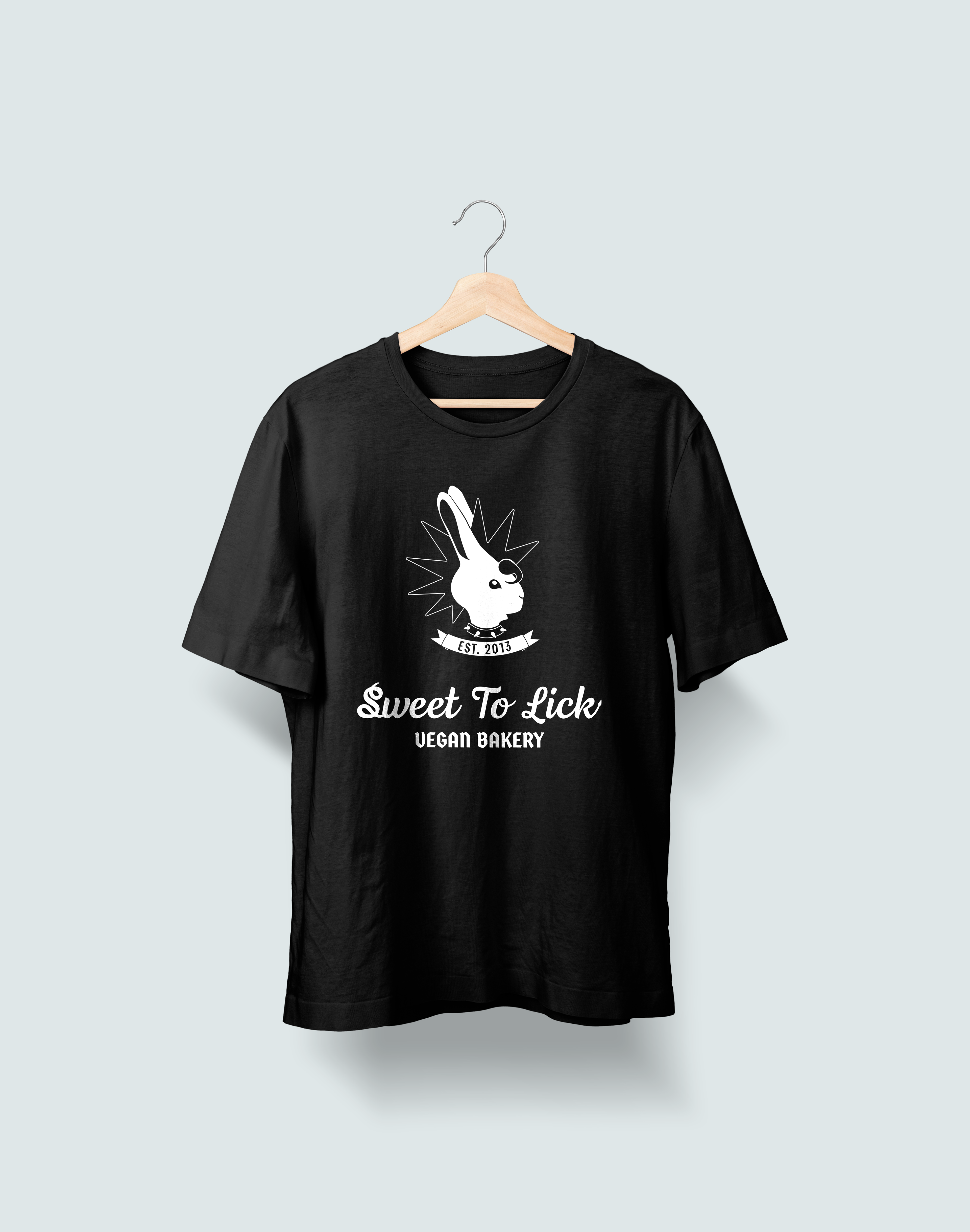
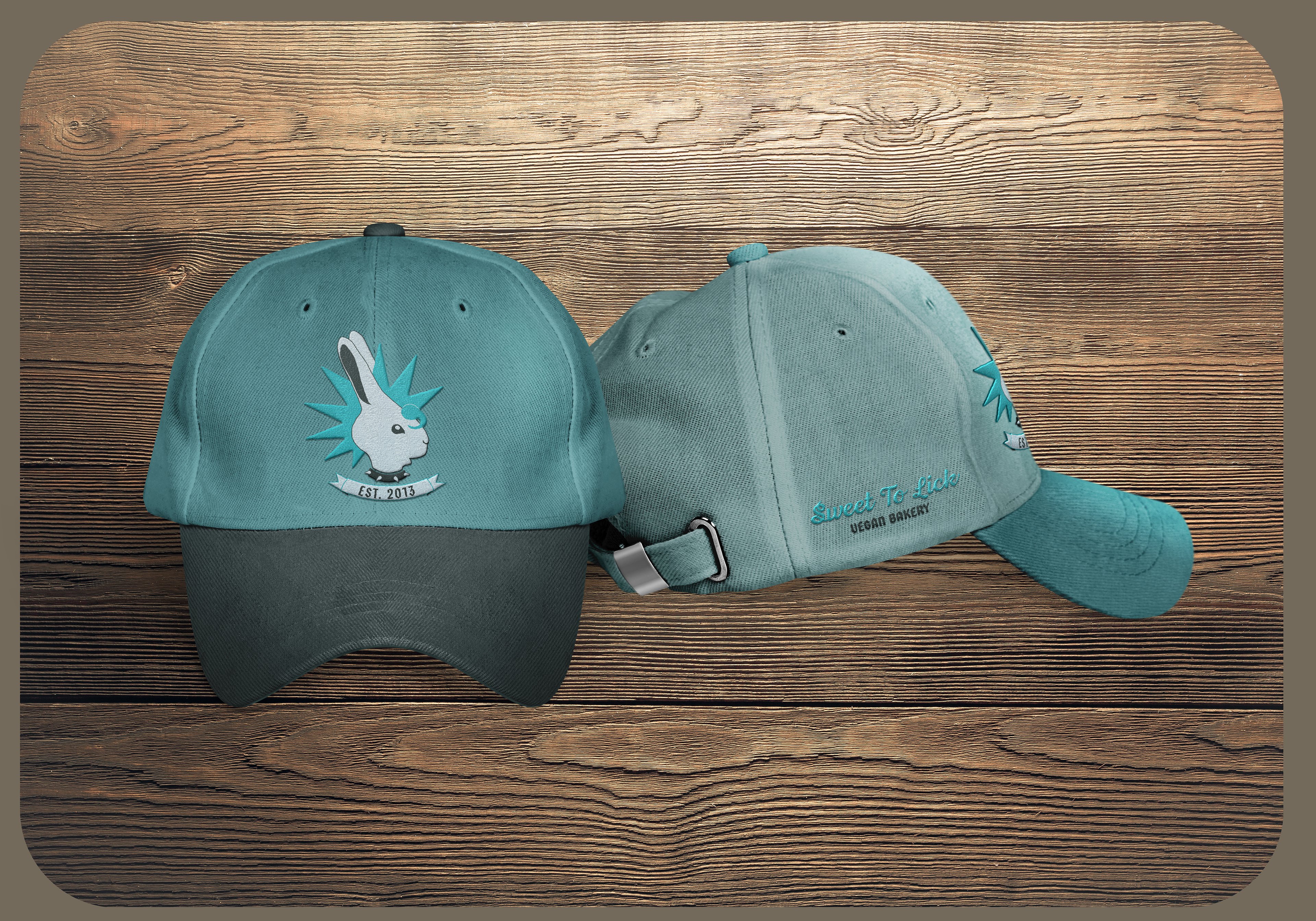
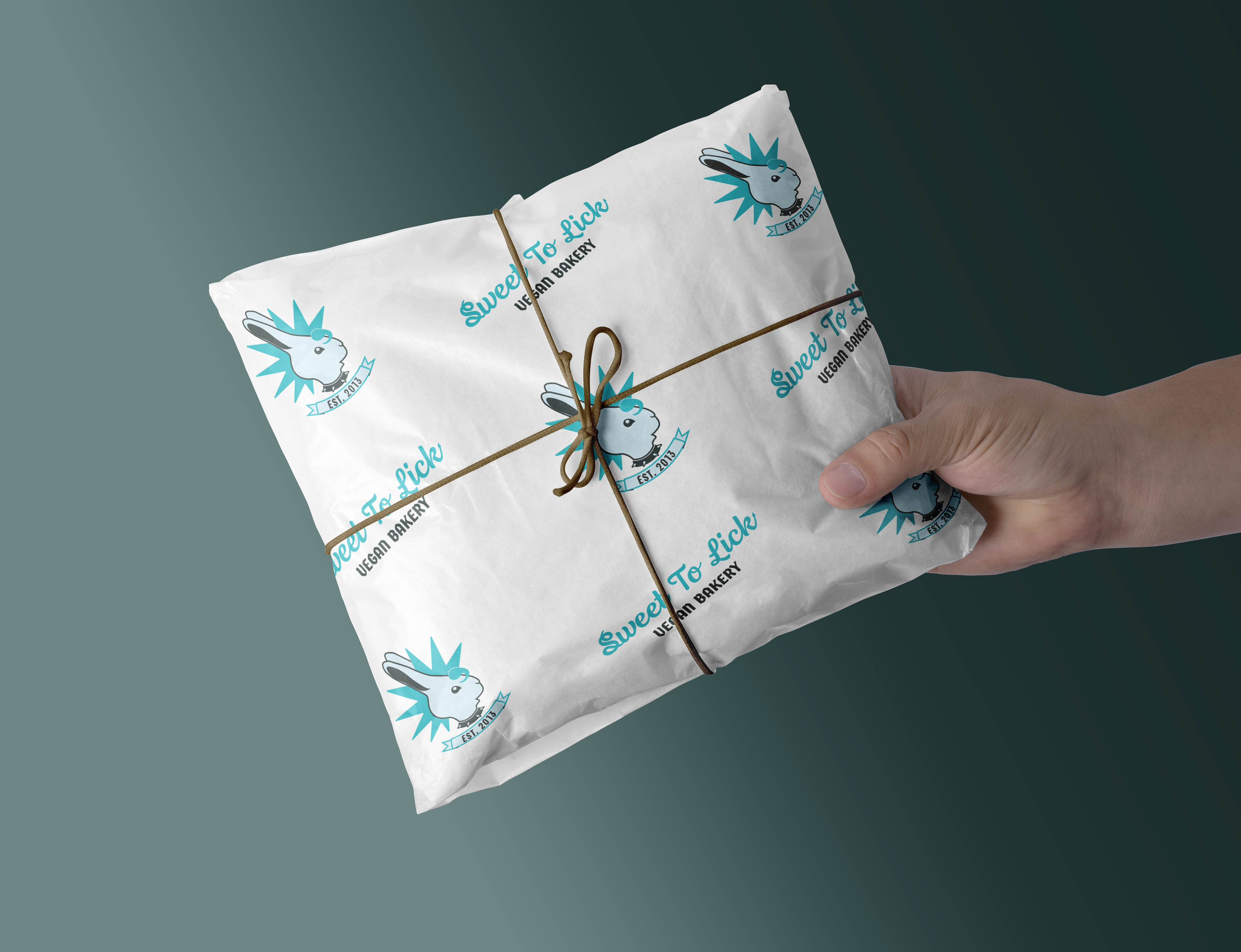
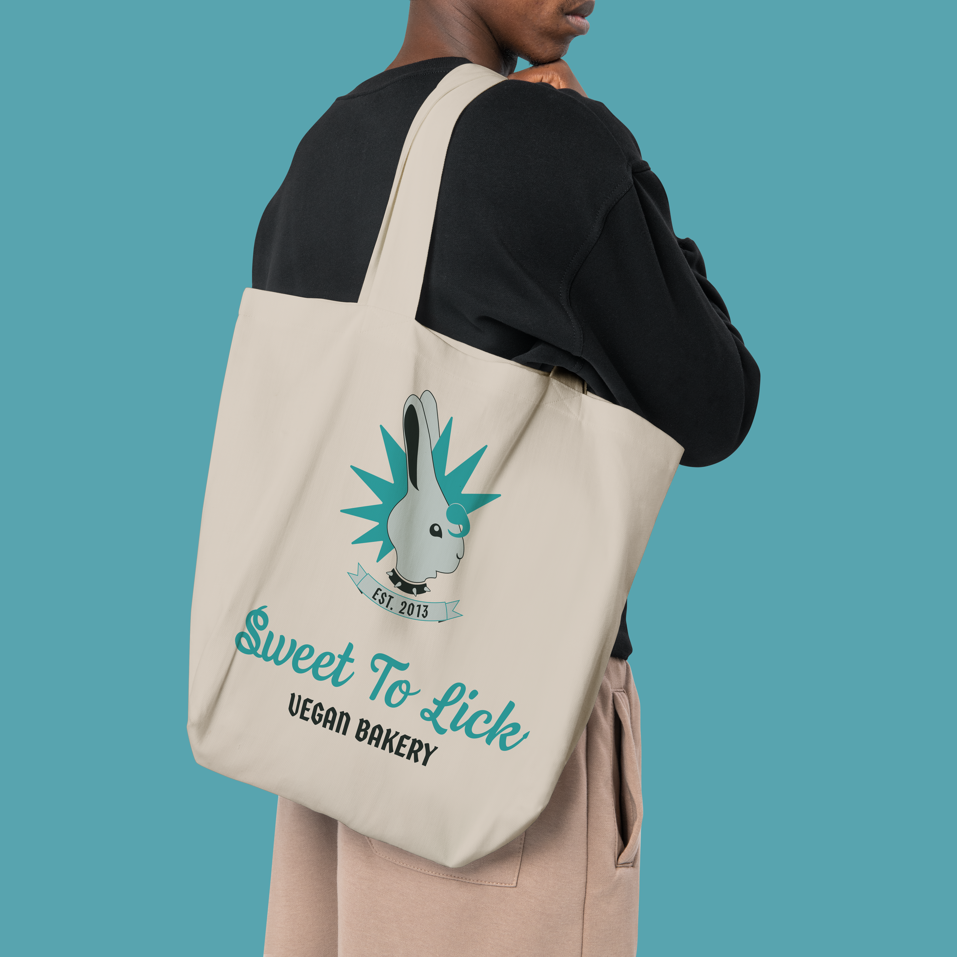
I like the fact that they had shirts and different variations, but the owner disclosed to me that their mascot was a cookie and a cupcake and I didn't see that being utilized in a very mascot-like way, so I opted to create different color ways and textures for the logo I created. I kept with the taupe, grey, and black color palette for the shirts, using full color for one and leaving the other two monochromatic to echo the original merchandise. I also expanded to creating a cap with an embroidered logo and signature as well as a tote bag, because I think the logo is very wearable and the demographic that would be buying from this bakery is also the type to go hiking or shopping at a farmer's market, where Sweet to Lick was originally born. I also added the logo onto butcher's paper because I knew they used the original medallion logo on their wrapping paper and those small personal touches deserved an update too. I also was considering making a butcher paper that was one color so it could be stamped, which has a more handmade feel.


